Overview
Jacquet brand commissioned studio 5•5 to create its new brand and packaging identity.
Strategy
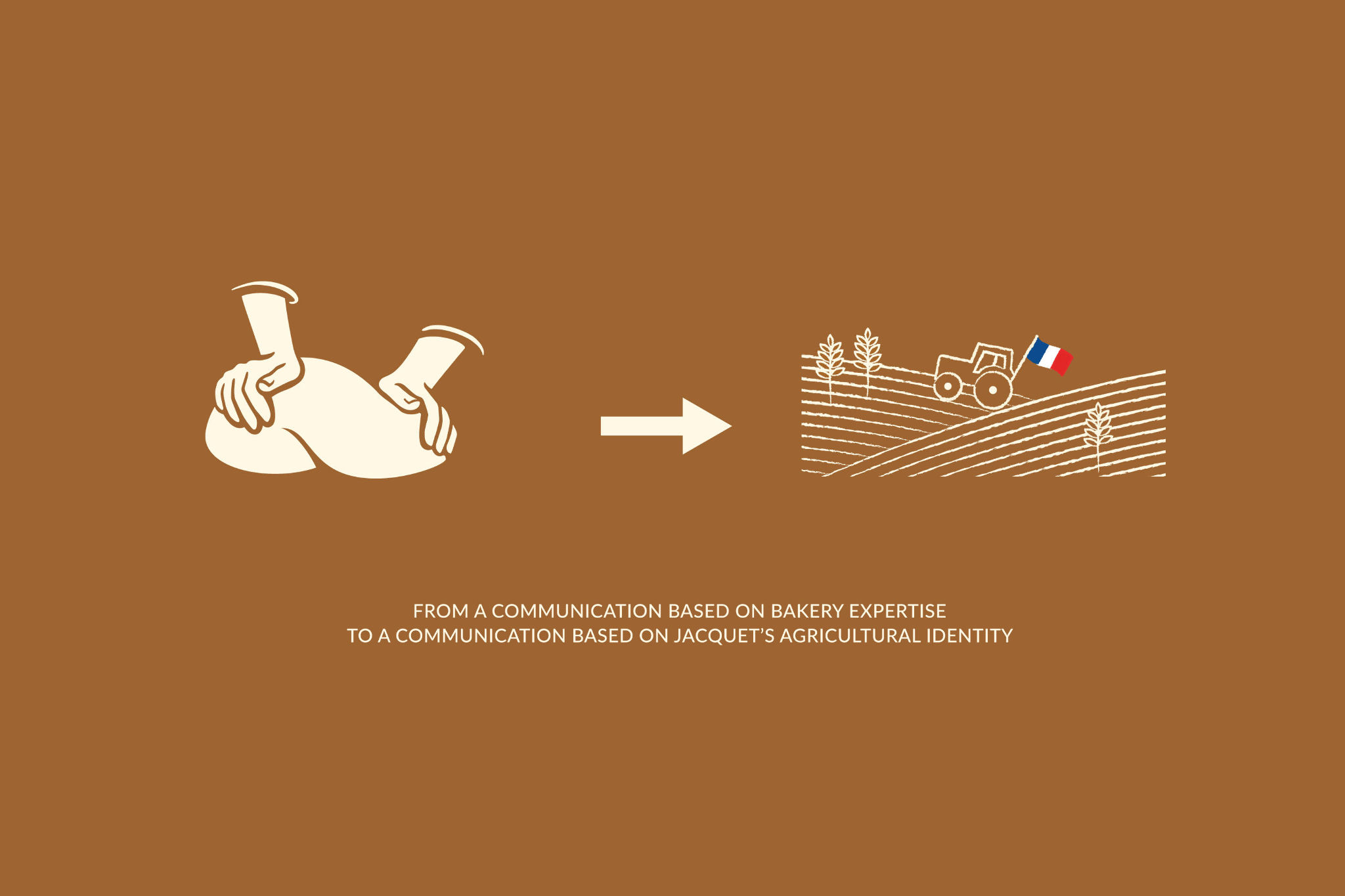
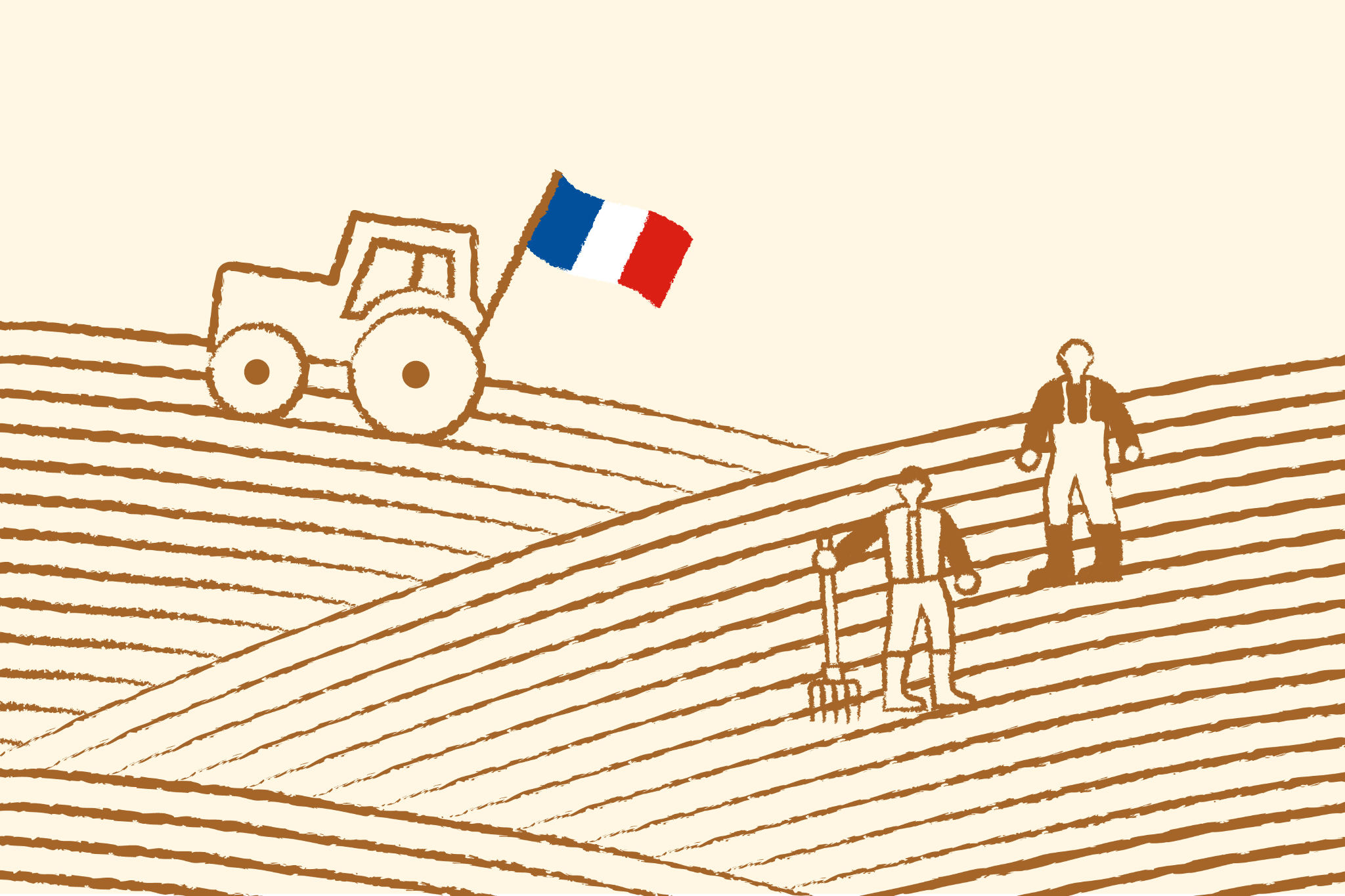
In the past, Jacquet has showcased its expertise as a breadmaker, as in the brand's previous logo which depicts hands kneading dough. But in the country of the baguette, it is hard to compete with the know-how of local bakers. We have also decided to refocus the Jacquet identity on what Jacquet really are – farmers, before bakers. Not many people know that Jacquet is first and foremost a cooperative of over 700 Auvergne wheat growers who operate a farm-to-product process that is 100% French.
Branding
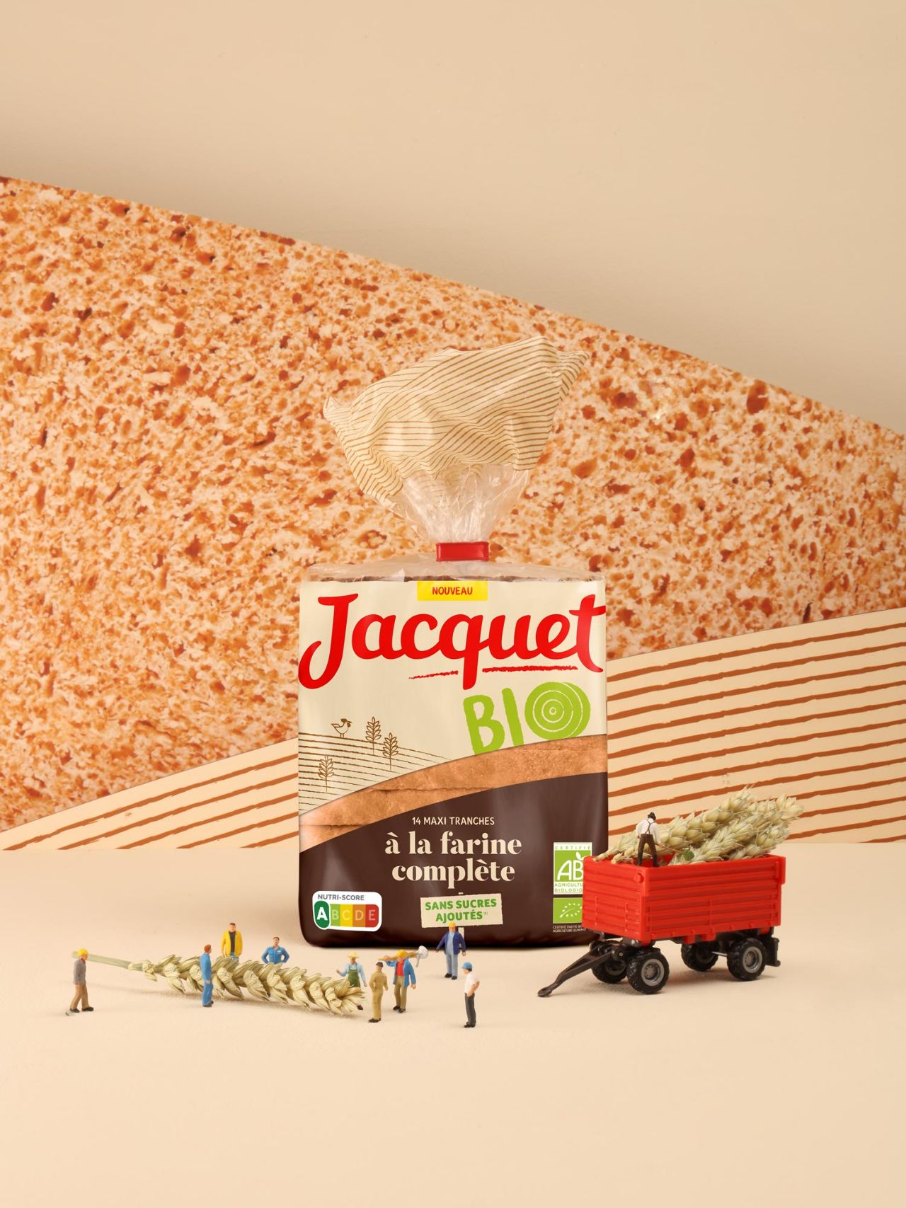
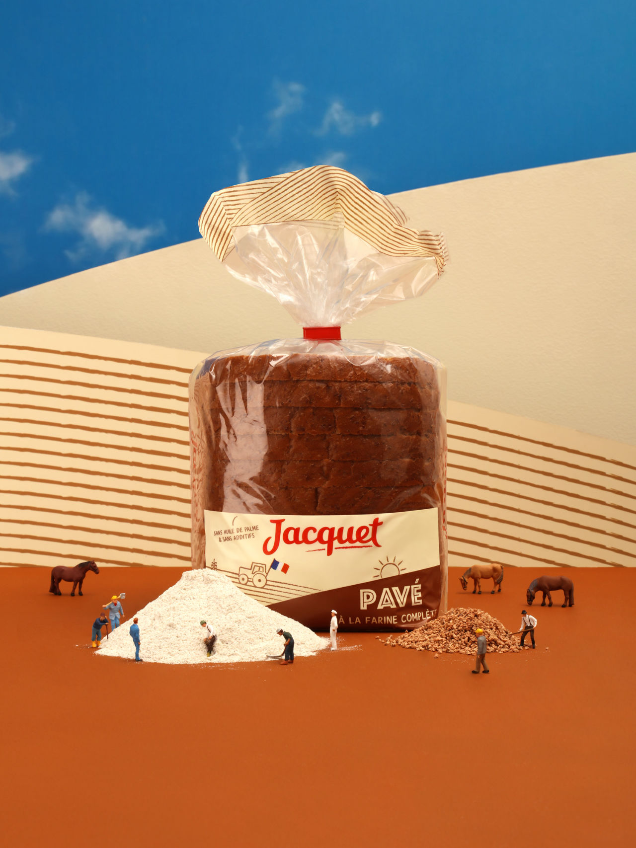
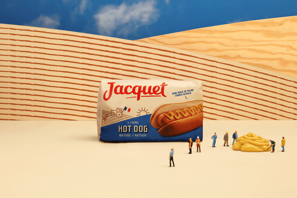
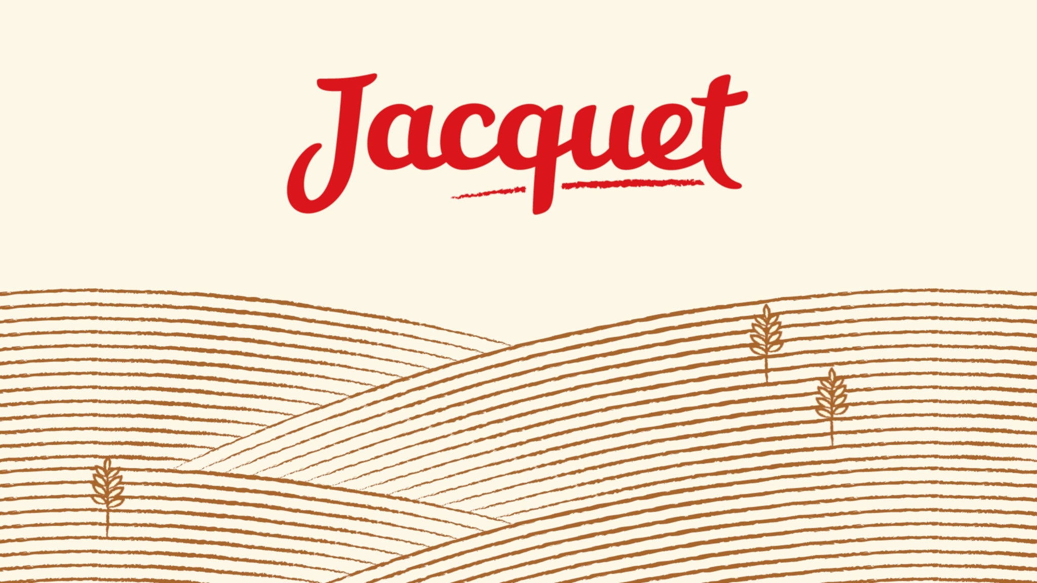
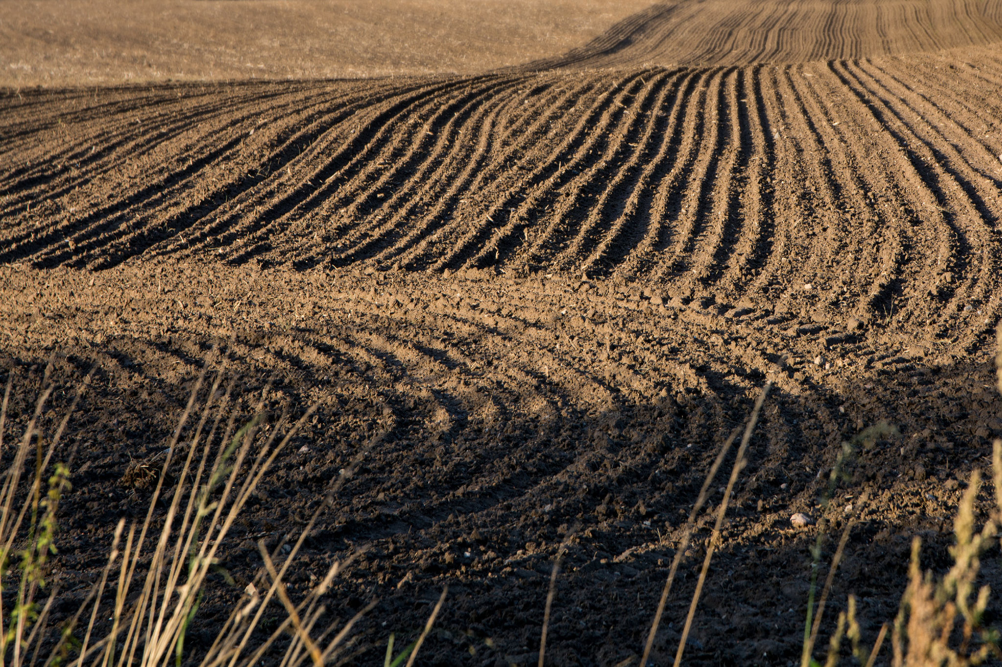
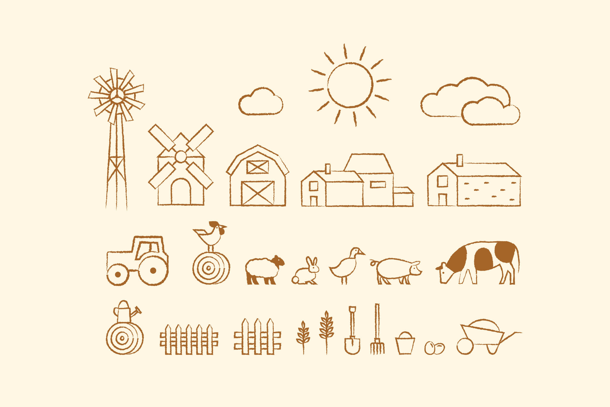
The new visual identity that we have imagined for Jacquet highlights the uniqueness of this brand which belongs to a cooperative of French farmers who grow wheat to make bread. Its agricultural roots are now expressed by an identifying motif depicting furrows in a wheat field ploughed by man. Coloured, graphical depictions of the Limage countryside, enhanced with script font and hand-drawn symbols to reaffirm the brand's human values. An immediately understandable graphic style that culminates in a logo now underscored by a furrow, to ensure perfect consistency with all the elements that comprise this new brand universe, reflecting its business culture.
The promotional film was produced by the Nouveau Monde agency.


Packaging
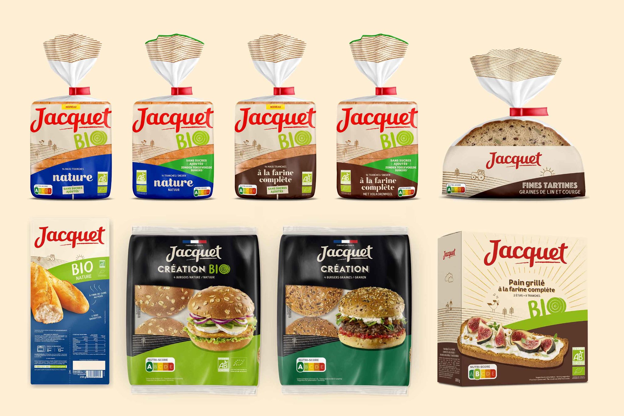
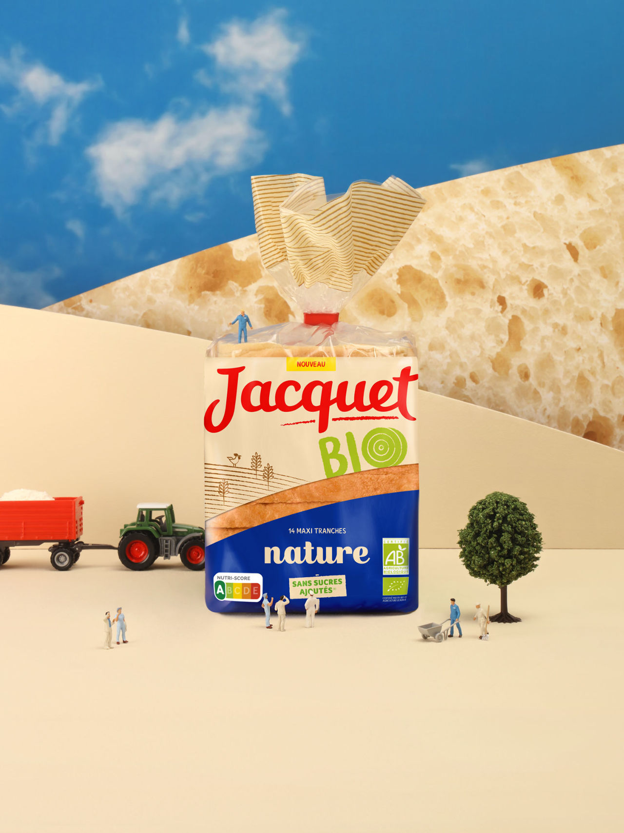
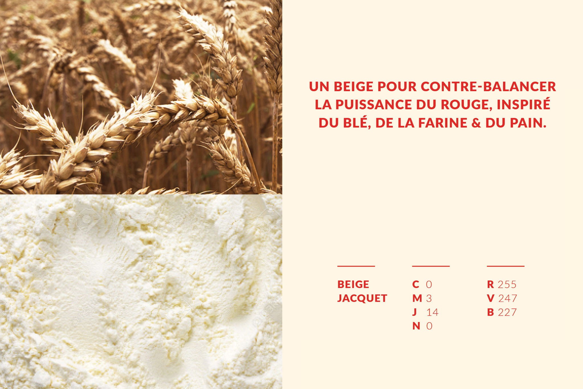
More than 130 products have been rebranded with Jacquet's new identity. This total revamp means the brand can find its way onto shelves with a new colour identity, a beige inspired by wheat and flour. By partially breaking from the established practices of other sandwich-bread brands, our new range stands out and attracts consumer interest. On the packaging, the identifying pattern of furrows is repeated on every side to form a landscape and becomes a theatre of agricultural scenes depicting the values of this cooperative.