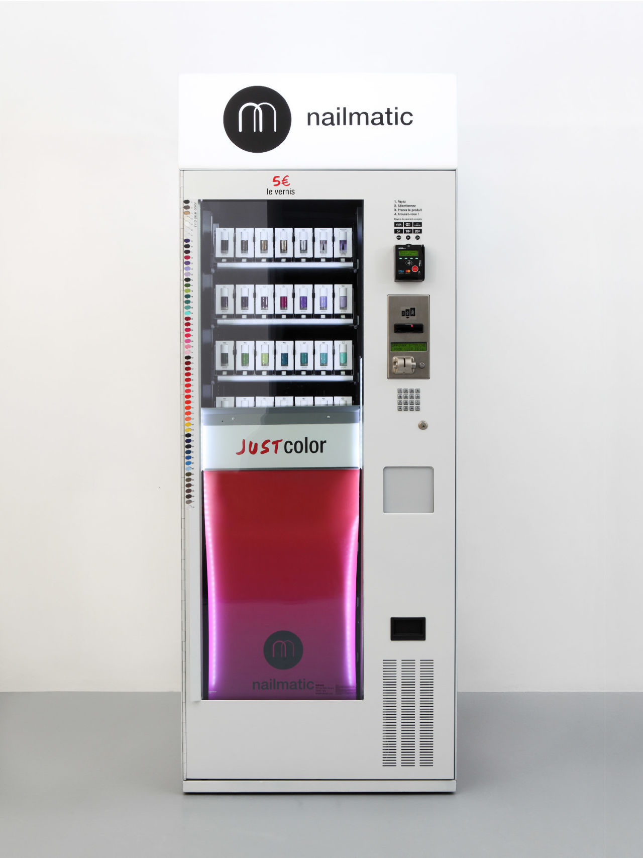
Overview
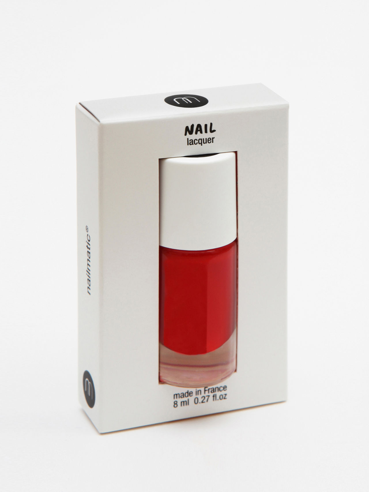
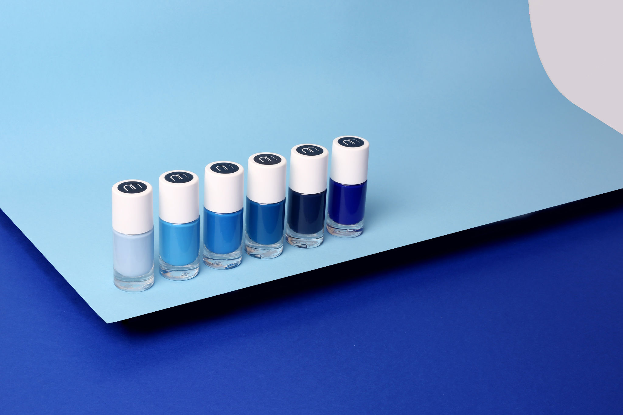
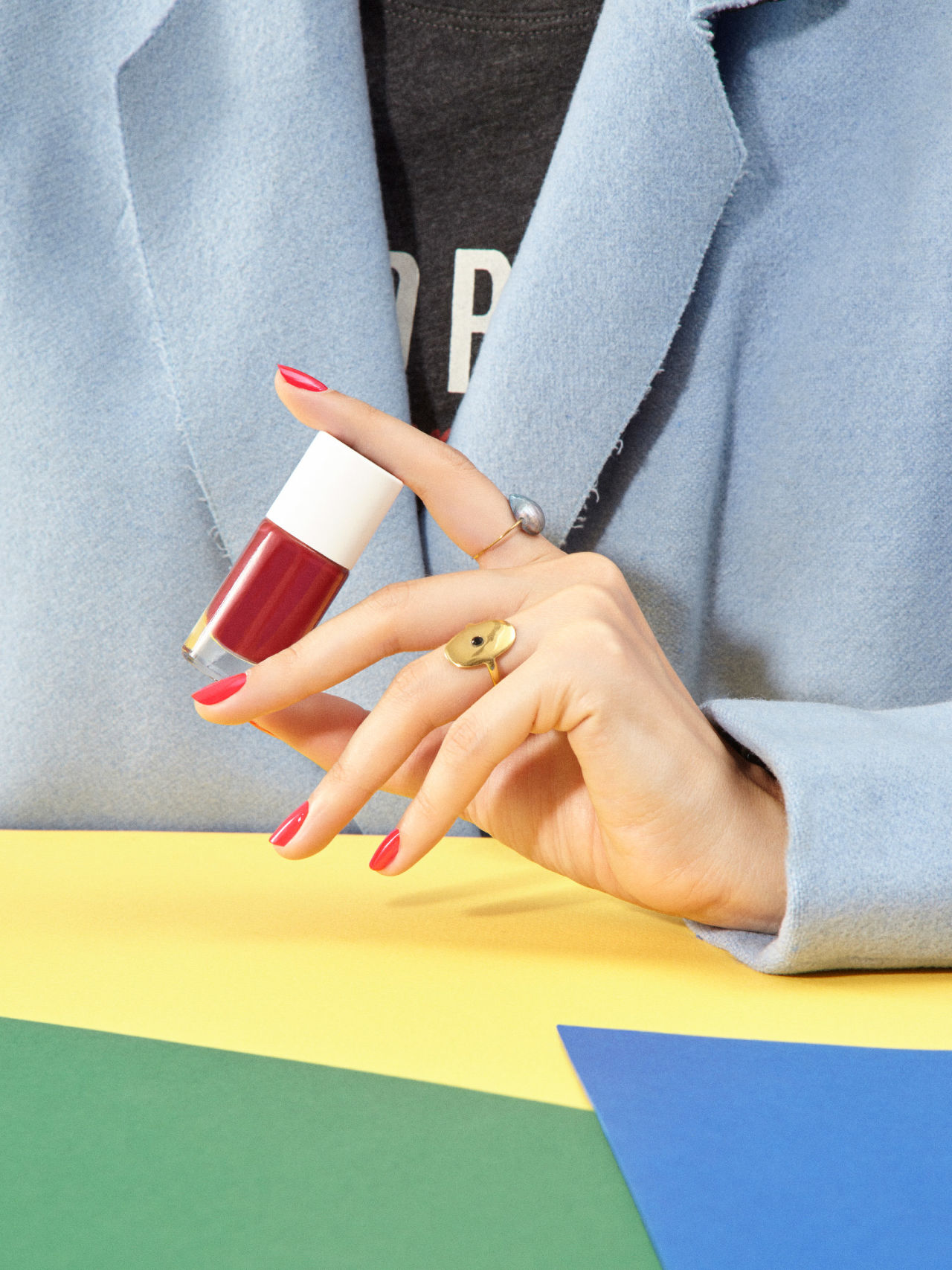
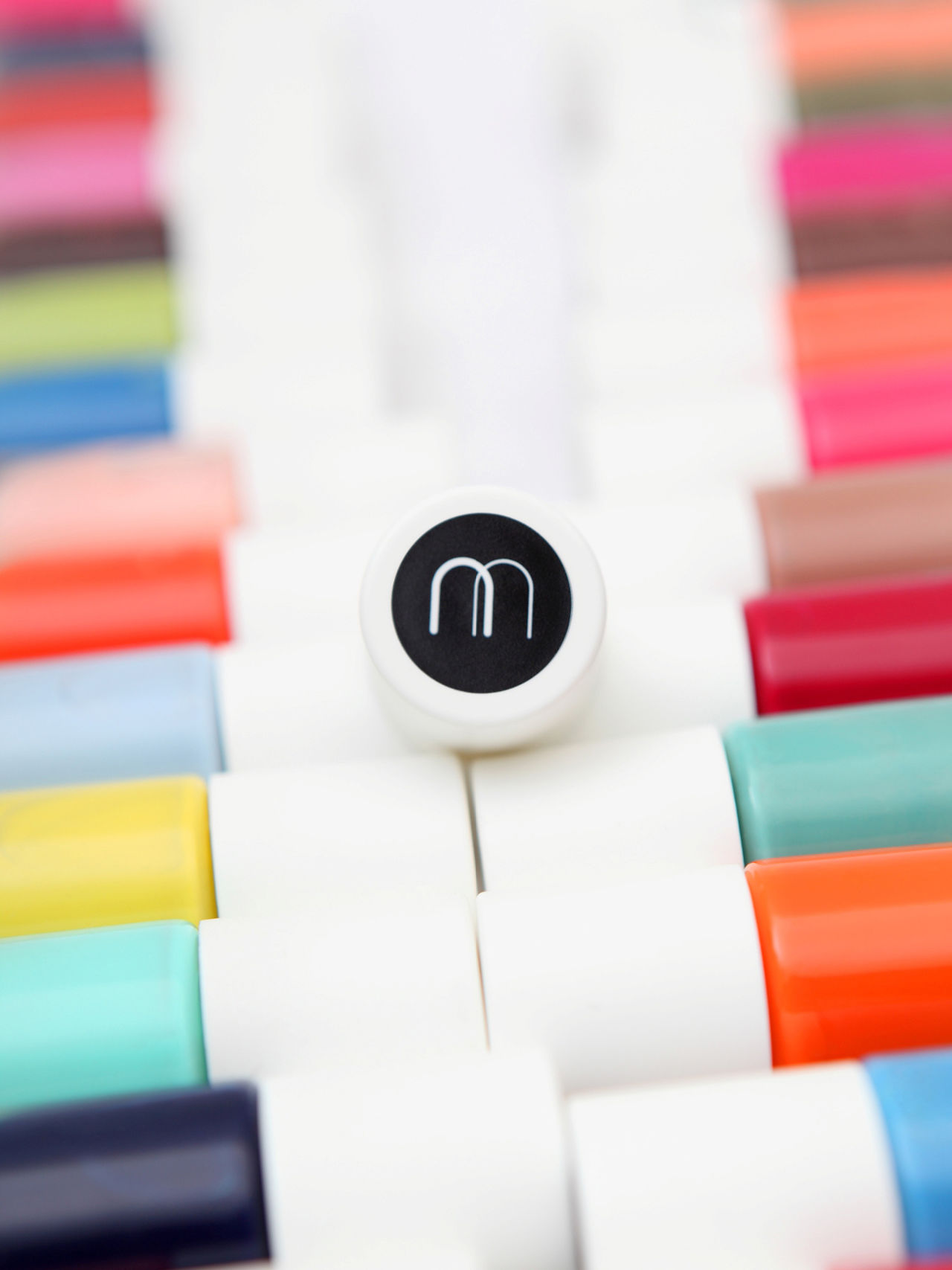
For Nailmatic, the number-1 nail polish brand sold in vending machines, 5•5 created an entire brand identity, including the logo, the machine and the nail polish packaging. We opted for a plain, textless bottle to bring out the colour. Only the monogram on the cap attests to Nailmatic quality.
Branding
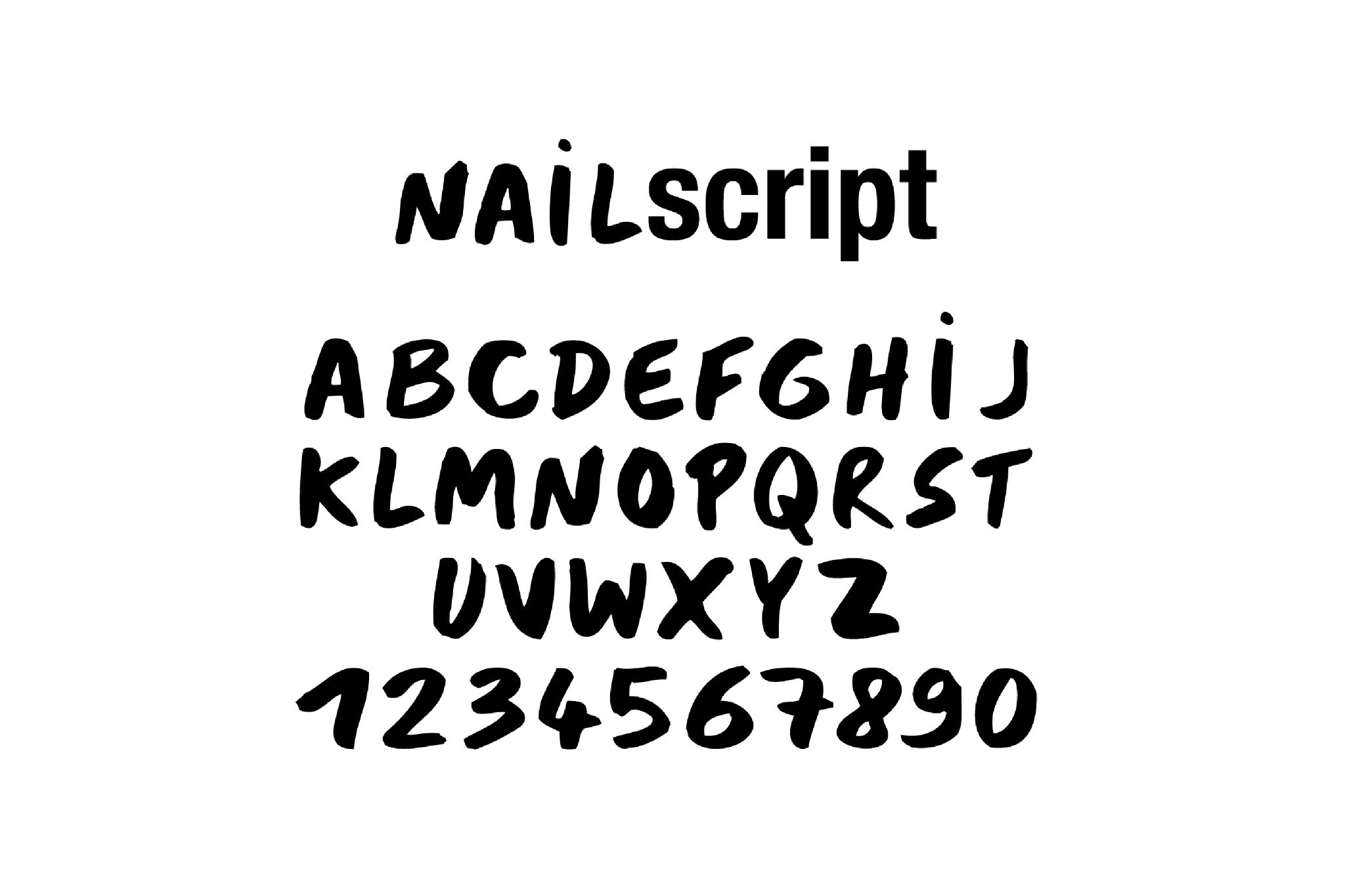
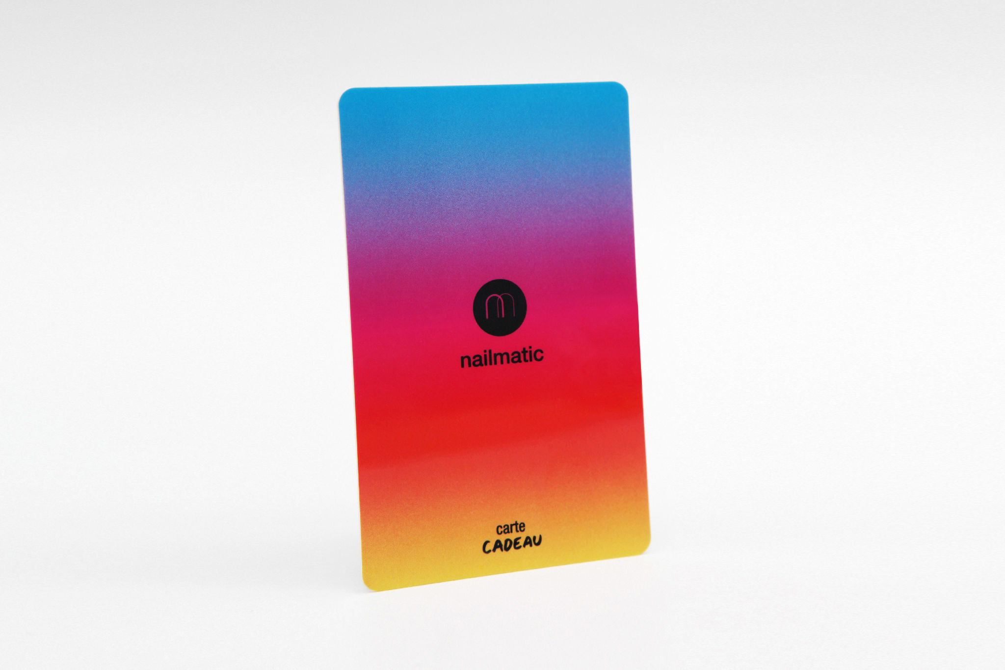
To showcase Nailmatic and its unique colour range, we chose to primarily use black and white. Nailmatic's identity was designed as a blank page that would let the colour speak for itself. All of these elements create a simple, refined graphic universe that reflects Nailmatic's products: high-quality basics. The handwriting complements this identity by conveying a less institutional, more free-spirited character, as if it were written with the polish brush.
Packaging
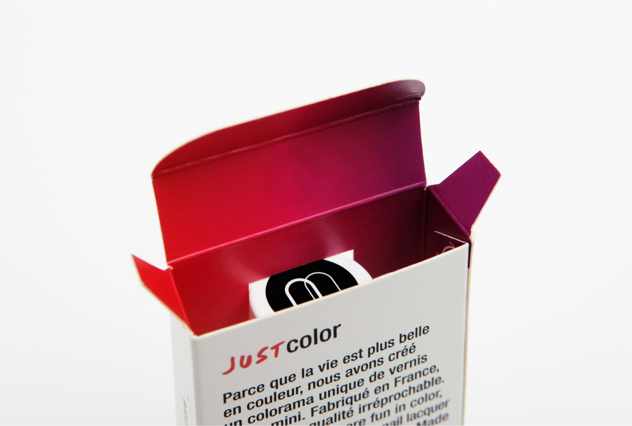
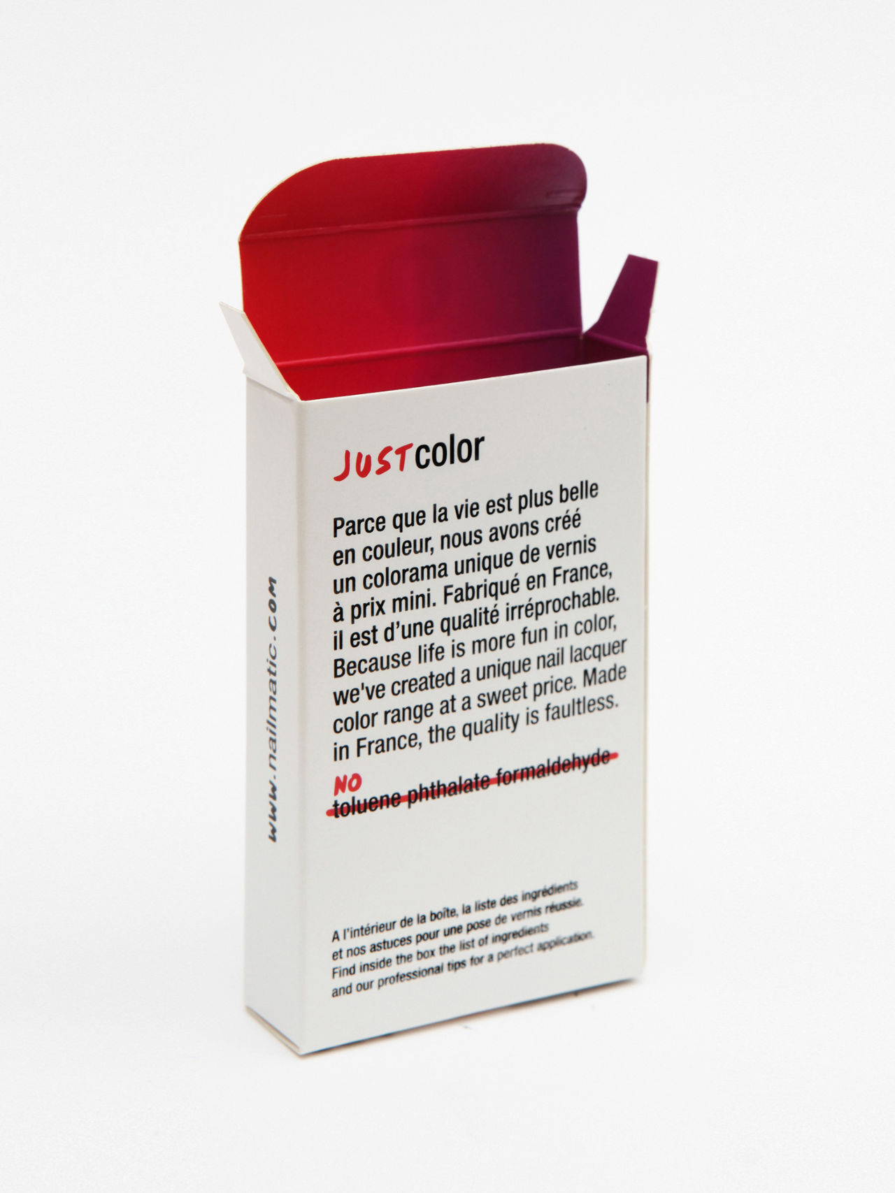
Our primary intention was to change the status of this small object by switching from commercial packaging with a lot of marketing content, to a small, streamlined fashion accessory that's easily brought along in a handbag.
The bottle is therefore kept simple, with the colour immediately visible, reflecting the brand's slogan, "Just Colour". Only the monogram on the top of the cap represents the brand and brands the product.