Overview
The studio 5•5 collaborate since 2015 with the famous spanish winery and worked on its new brand positionning, its graphic identity, an activation guideline, and a land design installation in the middle of the vineyards.
Strategy
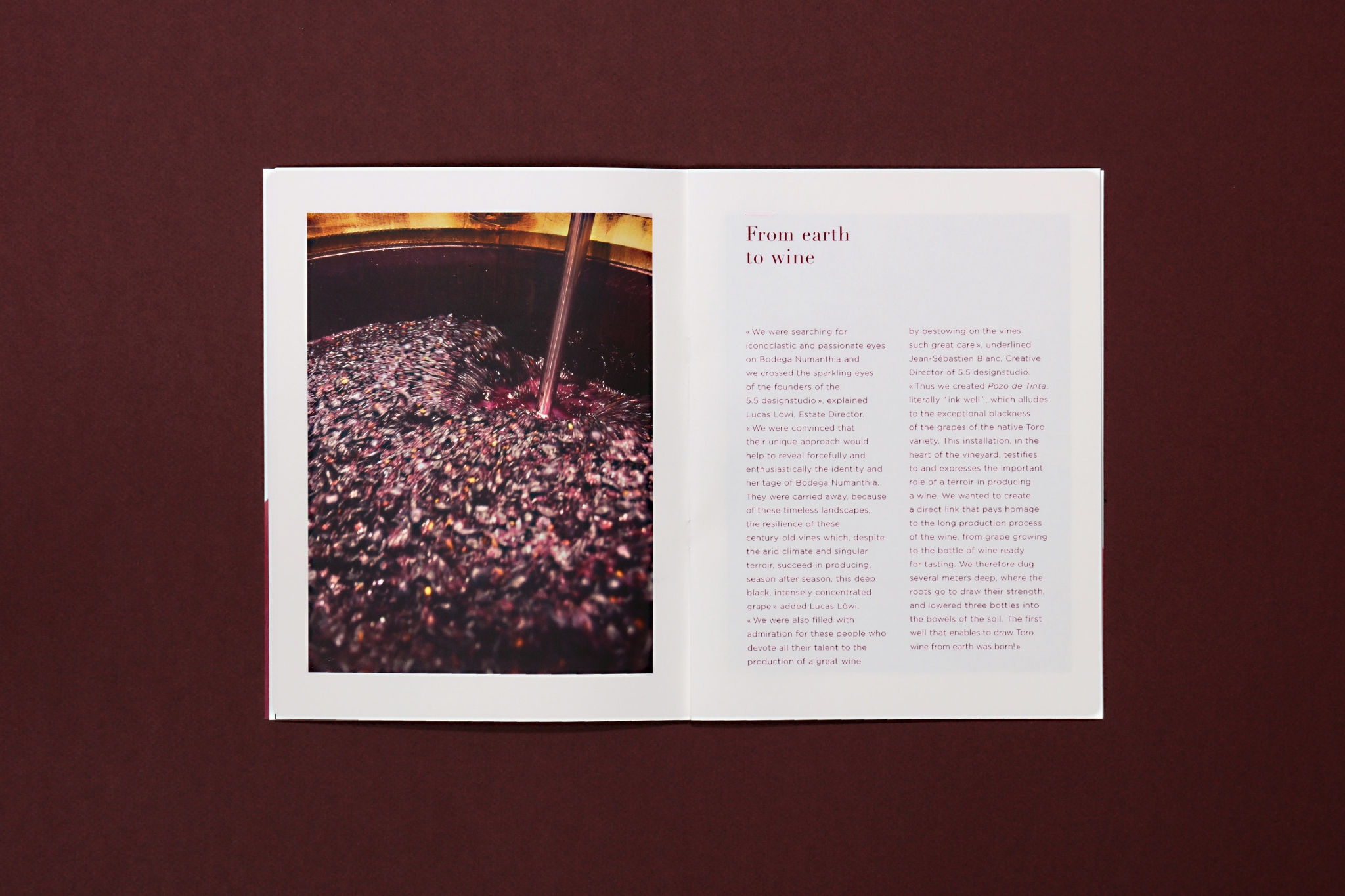
Moët Hennessy wine division commissioned the studio 5•5 to work on the brand strategy of the spanish winery Bodega Numanthia. The studio explored its history, its archives, interviewed the winery team, to rethink the brand strategy and identity of Bodega Numanthia. The studio wrote the manifesto, the vision, the mission, the brand DNA to constitute the brand book of the winery.

Branding
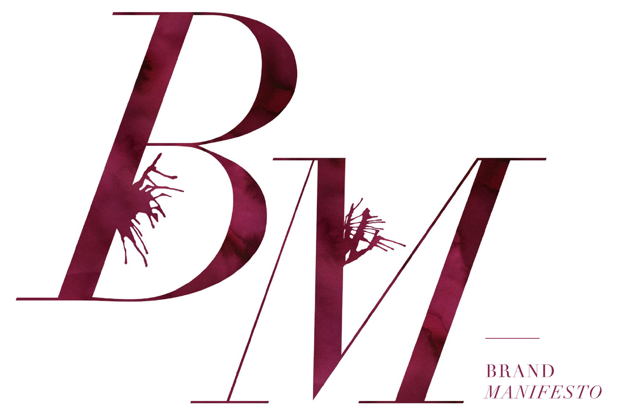
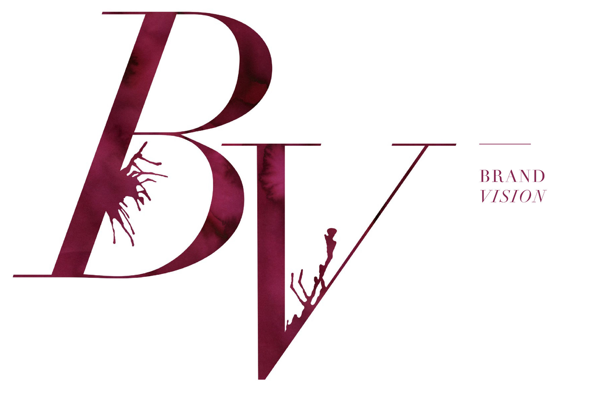
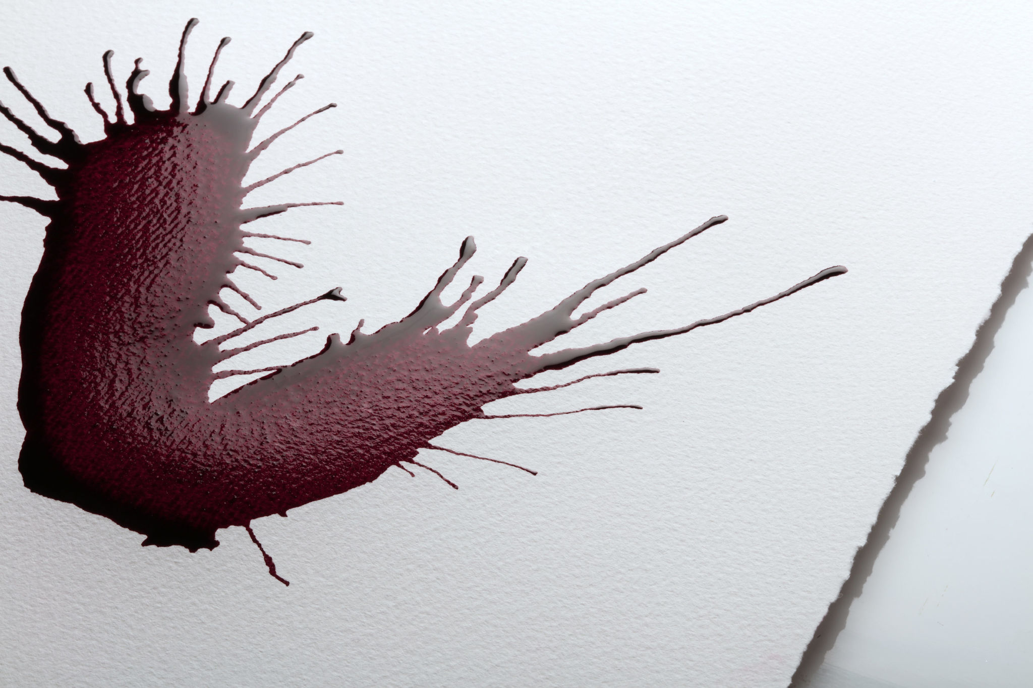
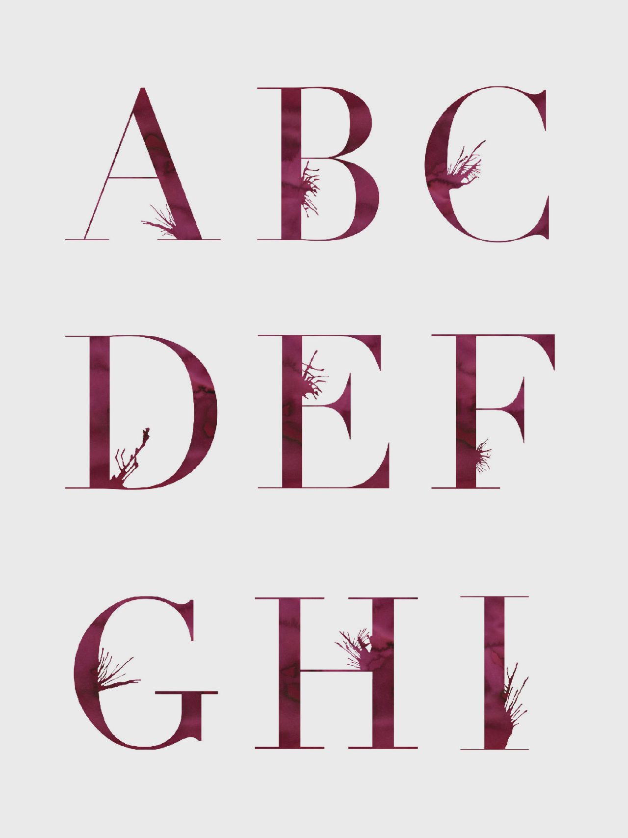
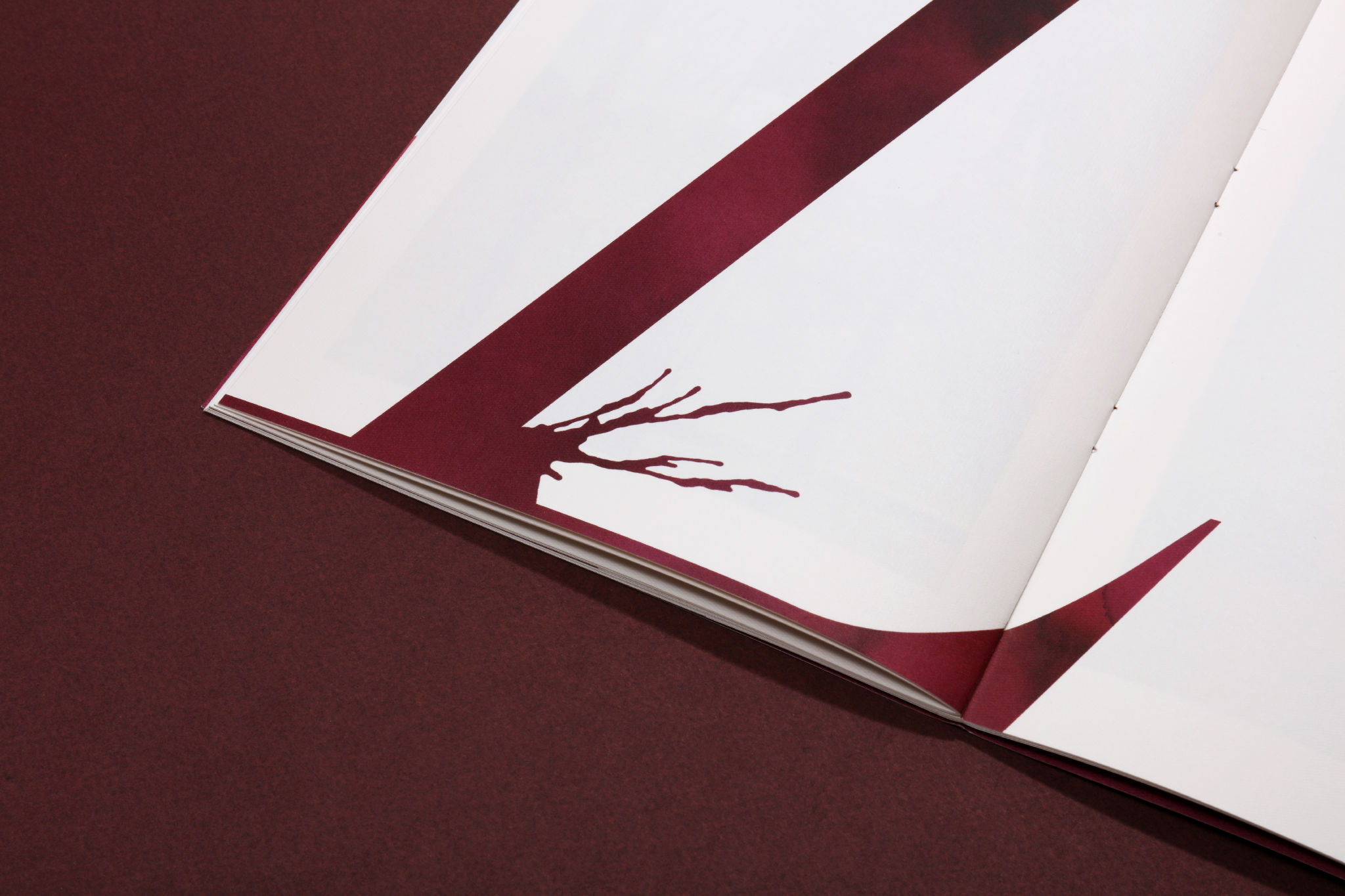
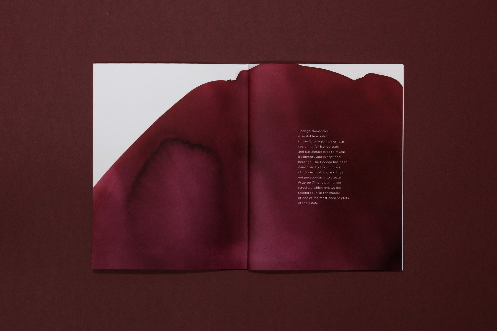
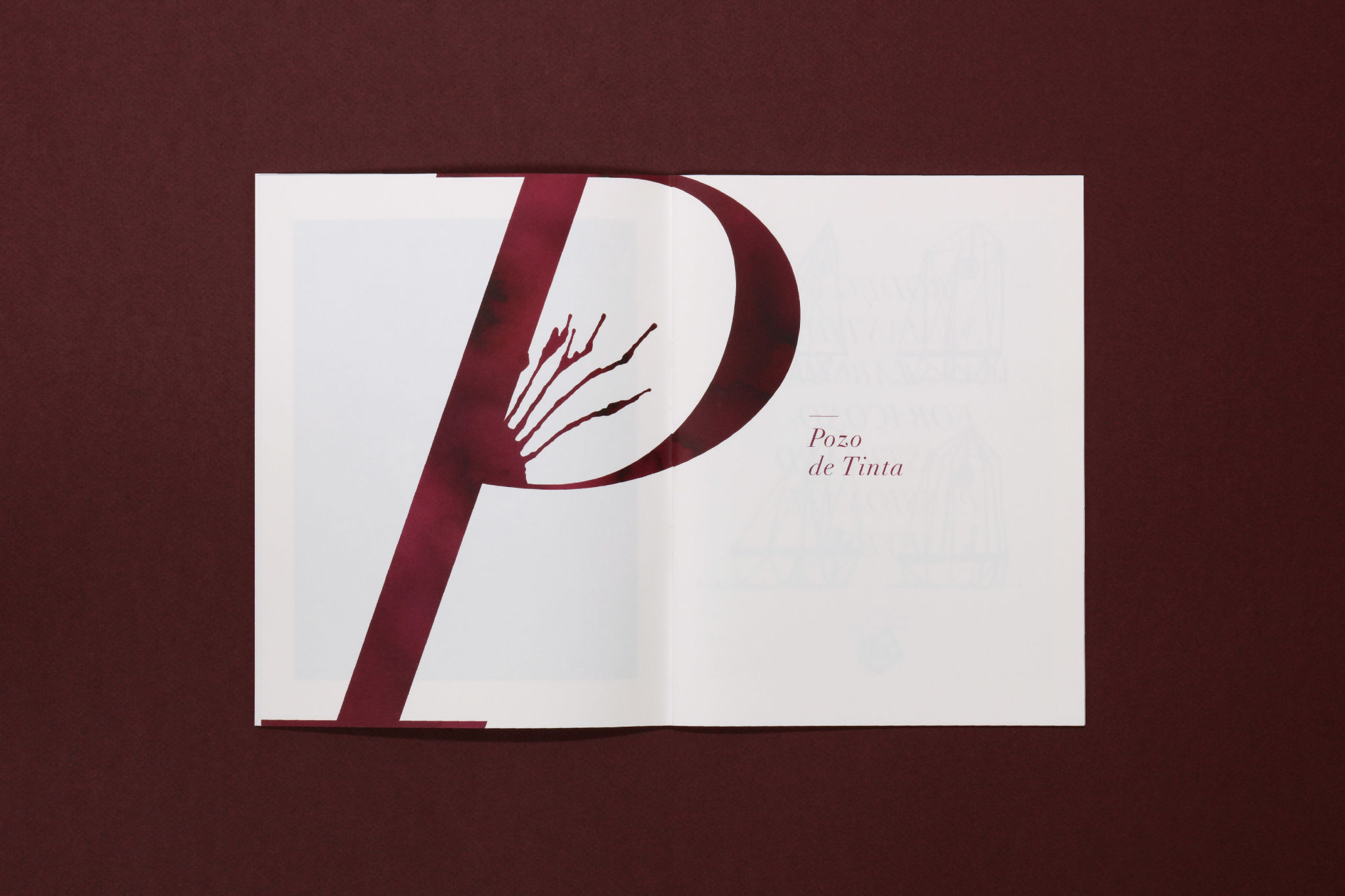
"Tinta de Toro" literally means "ink from Toro". It is also the emblematic varietal of Bodega Numanthia's wines. This name and strong imagery formed the starting point for the creation of the estate's graphic identity. The ink, resembling a strong wine, spreads across the paper and colours the brand's world by serving, in turn, as an iconographic filter or as a brand symbol. Like wine, ink is alive, and even when formed into oversized initials, it continues to spread and branch out, mirroring the centuries-old grapevines used to produce Bodega Numanthia's wines.

Architecture & retail
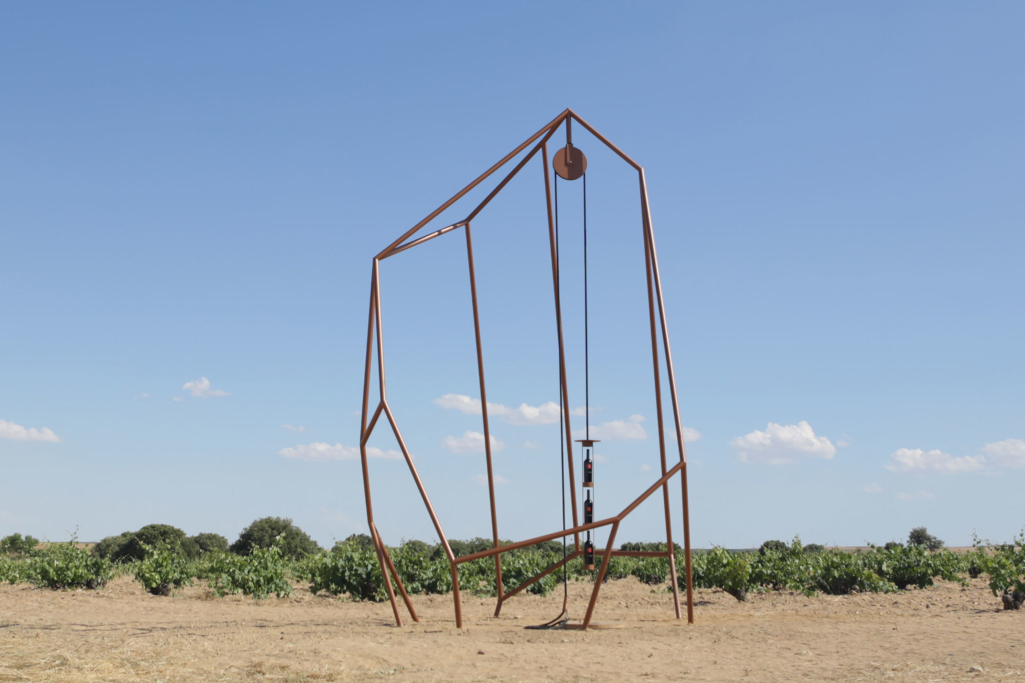
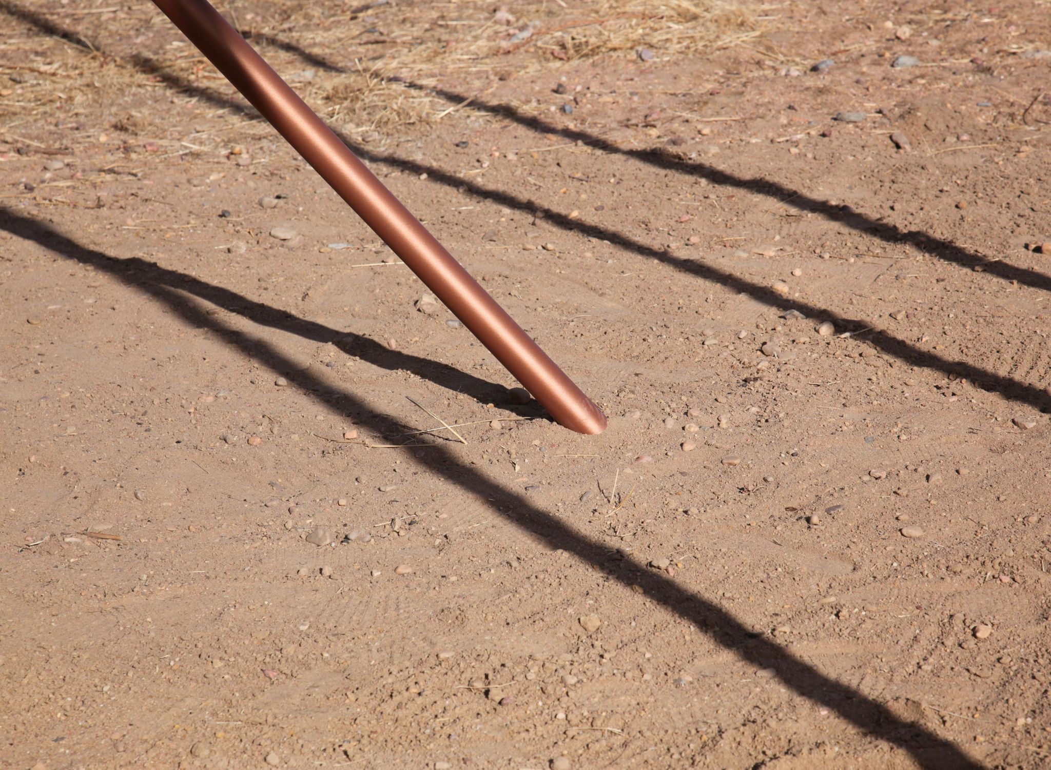
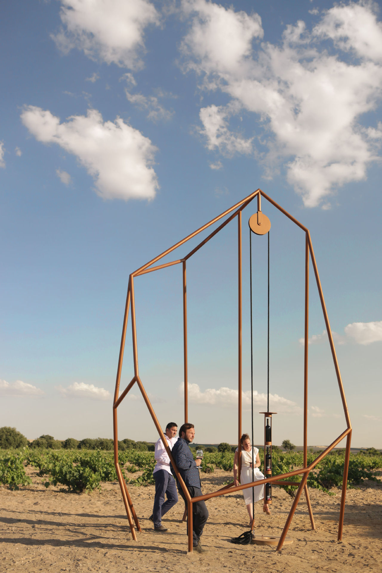
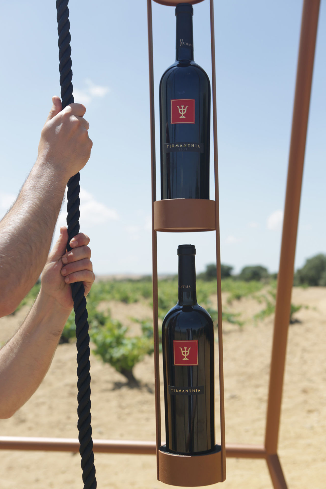
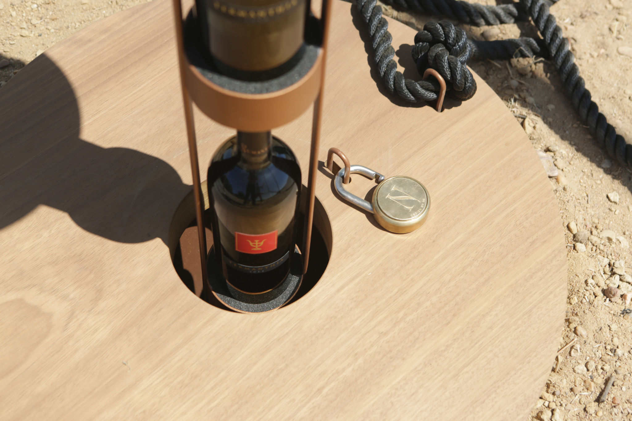
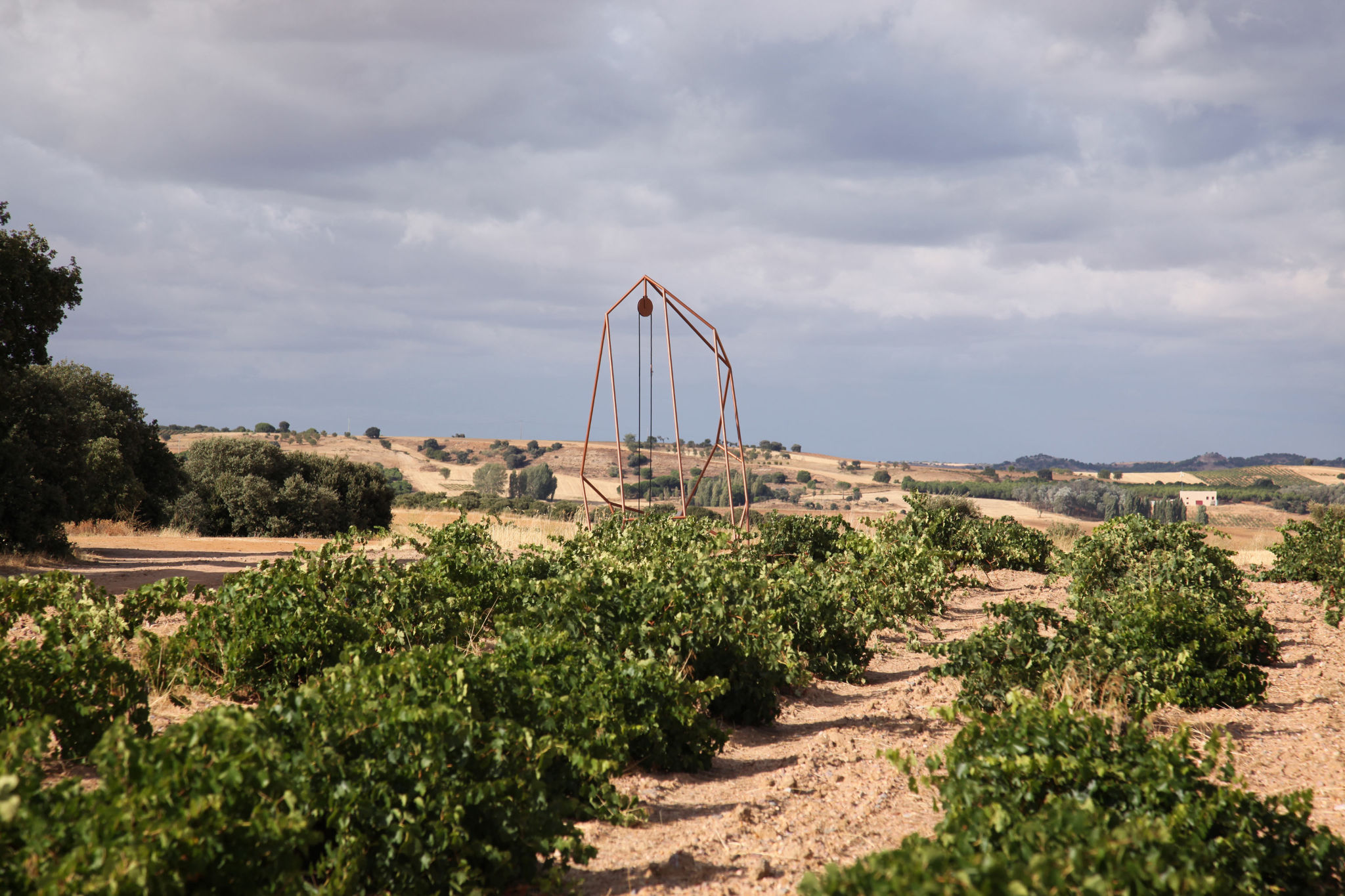
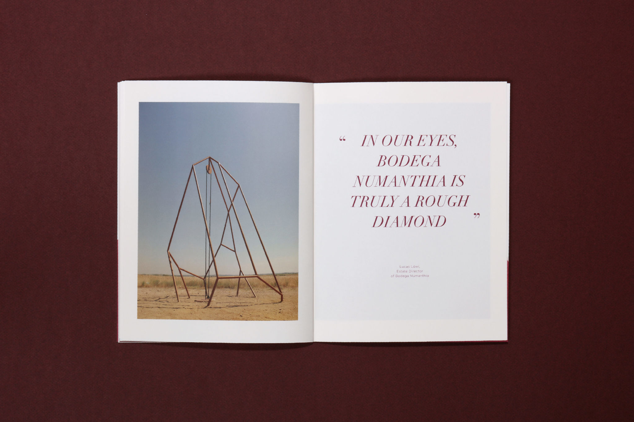
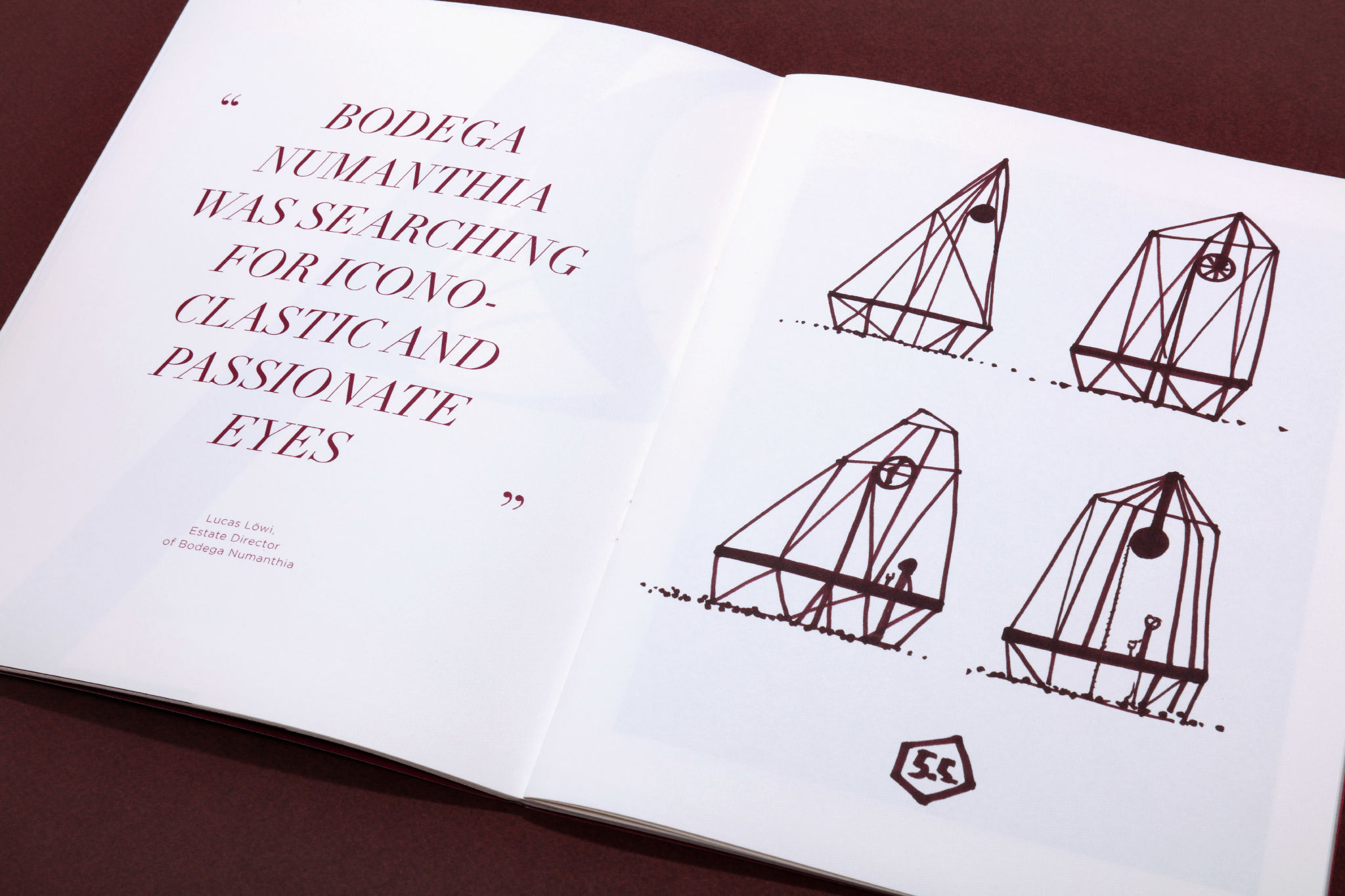
"To showcase the terroir and production of this powerful wine, we created an architectural structure among the vines that has a strong impact on the landscape. We thereby created a monument: the Diamond of Numanthia.
'Pozo de tinta' is an illustration and a deconstruction of this story; the wine comes out of the earth like a diamond."